在上一篇文章中讲解了什么是反射,以及利用反射可以获取程序集里面的哪些内容。在平时的项目中,可能会遇到项目需要使用多种数据库,这篇文章中将会讲解如何利用反射实现访问多种数据库。
项目整体结构如下图所示:
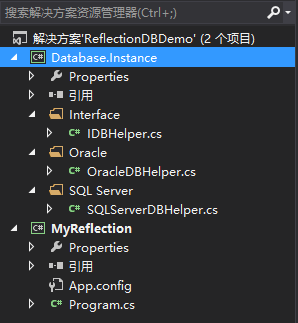
1、Database.Instance是一个类库文件,IDBHelper是一个接口,封装的访问数据库数据的CURD方法,OracleDBHelper和SQLServerDBHelper类实现IDBHelper接口,分别用来访问Oracle数据库和SQL Server数据库,接口和类的定义如下:
IDBHelper接口定义
 1 using System;
 2 using System.Collections.Generic;
 3 using System.Linq;
 4 using System.Text;
 5 using System.Threading.Tasks;
 6
 7 namespace Database.Instance.Interface
 8 {
 9     public interface IDBHelper
10     {
11         /// <summary>
12         /// 创建数据
13         /// </summary>
14         void Create();
15
16         /// <summary>
17         /// 更新数据
18         /// </summary>
19         void Update();
20
21         /// <summary>
22         /// 读取数据
23         /// </summary>
24         void Retrieve();
25
26         /// <summary>
27         /// 删除数据
28         /// </summary>
29         void Delete();
30     }
31 }
OracleDBHelper类定义如下
 1 using System;
 2 using System.Collections.Generic;
 3 using System.Linq;
 4 using System.Text;
 5 using System.Threading.Tasks;
 6 using Database.Instance.Interface;
 7
 8 namespace Database.Instance.Oracle
 9 {
10    public class OracleDBHelper :IDBHelper
11     {
12         public void Create()
13         {
14             Console.WriteLine("这是Oracle数据库执行创建操作");
15         }
16
17         public void Update()
18         {
19             Console.WriteLine("这是Oracle数据库执行更新操作");
20         }
21
22         public void Retrieve()
23         {
24             Console.WriteLine("这是Oracle数据库执行读取操作");
25         }
26
27         public void Delete()
28         {
29             Console.WriteLine("这是Oracle数据库执行删除操作");
30         }
31     }
32 }
SQLServerDBHelper类定义如下
 1 using System;
 2 using System.Collections.Generic;
 3 using System.Linq;
 4 using System.Text;
 5 using System.Threading.Tasks;
 6 using Database.Instance.Interface;
 7
 8 namespace Database.Instance.SQL_Server
 9 {
10     public class SQLServerDBHelper:IDBHelper
11     {
12         public void Create()
13         {
14             Console.WriteLine("这是SQL Server数据库执行创建操作");
15         }
16
17         public void Update()
18         {
19             Console.WriteLine("这是SQL Server数据库执行更新操作");
20         }
21
22         public void Retrieve()
23         {
24             Console.WriteLine("这是SQL Server数据库执行读取操作");
25         }
26
27         public void Delete()
28         {
29             Console.WriteLine("这是SQL Server数据库执行删除操作");
30         }
31     }
32 }
2、MyReflection是一个控制台程序,用来测试
一、使用原始方法实现
使用原始的方法实现代码如下:
 1 using Database.Instance.Interface;
 2 using Database.Instance.Oracle;
 3 using System;
 4 using System.Collections.Generic;
 5 using System.Linq;
 6 using System.Text;
 7 using System.Threading.Tasks;
 8 using System.Reflection;
 9 using System.Configuration;
10
11 namespace MyReflection
12 {
13     class Program
14     {
15         static void Main(string[] args)
16         {
17             // 实例化(调用Oracle数据库)
18             IDBHelper dbHelper = new OracleDBHelper();
19             // 调用方法
20             dbHelper.Create();
21             dbHelper.Update();
22             dbHelper.Retrieve();
23             dbHelper.Delete();
24
25             Console.ReadKey();
26         }
27     }
28 }
程序运行结果:
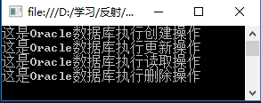
存在的问题:如果换一种数据库,那么就需要修改实例化的代码,例如更换SQL Server数据库,那么代码修改如下:
IDBHelper dbHelper = new SQLServerDBHelper(); 这样很不方便,每次更换数据库的时候,都需要修改实例化的代码,有没有什么方便的方法可以做到不需要修改代码就可以实现更换数据库呢?办法就是使用反射加配置文件实现。
二、使用反射加配置文件实现
配置文件结构如下:
 1 <?xml version="1.0" encoding="utf-8" ?>
 2 <configuration>
 3   <appSettings>
 4     <!--key表示定义的接口 value格式 要加载的程序集名称,要实例化的类 value值中间以','分割-->
 5     <add key="Database.Instance.Interface.IDBHelper" value="Database.Instance,Database.Instance.Oracle.OracleDBHelper"/>
 6   </appSettings>
 7     <startup>
 8         <supportedRuntime version="v4.0" sku=".NETFramework,Version=v4.5.1" />
 9     </startup>
10 </configuration>
Program类定义如下:
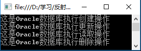
 1 using Database.Instance.Interface;
 2 using Database.Instance.Oracle;
 3 using Database.Instance.SQL_Server;
 4 using System;
 5 using System.Collections.Generic;
 6 using System.Linq;
 7 using System.Text;
 8 using System.Threading.Tasks;
 9 using System.Reflection;
10 using System.Configuration;
11
12 namespace MyReflection
13 {
14     class Program
15     {
16         static void Main(string[] args)
17         {
18             // 根据key值读取对应的value值
19             string[] config = ConfigurationManager.AppSettings["Database.Instance.Interface.IDBHelper"].Split(',');
20             // 加载程序集 config[0]=Database.Instance
21             Assembly assembly = Assembly.Load(config[0]);
22
23             // 根据类的完全限定名找出类型 config[1]= Database.Instance.Oracle.OracleDBHelper
24             Type type = assembly.GetType(config[1]);
25             // 根据类型创建对象
26             object obj = Activator.CreateInstance(type);
27             //实例化
28             IDBHelper dbHelper = obj as IDBHelper;
29             dbHelper.Create();
30             dbHelper.Update();
31             dbHelper.Retrieve();
32             dbHelper.Delete();
33             Console.ReadKey();
34         }
35     }
36 }
运行结果如下:
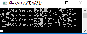
如果更新数据库,只需要更新配置文件中value的值即可,例如要更换SQL Server数据库,配置文件修改如下:
 1 <?xml version="1.0" encoding="utf-8" ?>
 2 <configuration>
 3   <appSettings>
 4     <!--key表示定义的接口 value格式 要加载的程序集名称,要实例化的类 value值中间以','分割-->
 5     <add key="Database.Instance.Interface.IDBHelper" value="Database.Instance,Database.Instance.SQL_Server.SQLServerDBHelper"/>
 6   </appSettings>
 7     <startup>
 8         <supportedRuntime version="v4.0" sku=".NETFramework,Version=v4.5.1" />
 9     </startup>
10 </configuration>
Program类不需要修改,运行结果如下:
示例代码下载地址:https://pan.baidu.com/s/1mkf20WC